Read the Free Trolleyville Times Monthly for the Latest News on Prototype and Model Traction!
Showing posts with label Floquil. Show all posts

Monday, October 04, 2021

For Justice and Glory!

 Anybody Remember the Keystone Cops?

I thought it would be funny to model them.


The Keystone Cops (often spelled "Keystone Kops") are fictional, humorously incompetent policemen featured in silent film slapstick comedies produced by Mack Sennett for his Keystone Film Company between 1912 and 1917  -  Wikipedia

After the demise of Jordan Highway Miniatures vehicles I started looking around for other period models. This Model T Ford is a 3d print from Robert Sprague 3D Designs on Shapeways. It's not as fine of a model as Jordan but I wanted to see what I could do with it.

Tru-color paint was used for the black.  But the Floquil metallic paint used on the radiator and other details turned out too glittery for my taste. It works fine on tiny details like the hubcaps, but the broad expanse of the radiator and even the marker lamps is too much. A brass colored paint would look a lot better for this.  As is typical of 3D prints the model has some visible strata from the printing process and some details are oversized to meet the 1mm minimum thickness.  
But truth be told- I'm trying to get G scale results with HO scale models with this ultra close-up photography I'm doing. But really the model looks just fine when observing the scene when standing next to the layout.

So it is what it is.  When it comes time to populate my layout with automobiles I'll reassess this model to see if I'll use it or not.  And then I called the Model T project finished for now.


Then, while researching something unrelated, I came across this production still from a Keystone Cops flick.  "Hm! I wonder if I could model that" I wondered to myself . "Well... I do have that Model T model and covering it with cops would hide most of it defects" I replied to myself. "Ah- but what about all those cops" I countered, "nobody manufactures HO scale cops like that". Darn! I was right. I was defeated. Until I came across this:  
 
Preiser Unpainted Firemen. The uniforms are really similar and they even have those helmets like the Keystone Cops! Well what do you know?  Everything fell into place. This is a feasible project after all. Well I gotta do it now!

Trying out different figures to see where and how many I can fit.

The 12 selected figures were primed with Tru-Color grey primer.  Then they were painted with FolkArt craft paint. Not as nice as model paint but effective. The buttons and badges were painted with the same Floquil Brass glitter paint as the automobile. 

The Walrus Moustaches are a must!  Now its time to see how many of these guys I can fit in the auto.

I really didn't expect to fit them all in- but they all fit in! Well technically the 12th one isn't IN the car but is running to catch up.

Here is the photo set-up. My phone that I'm taking the pictures with doesn't fit under the overhead wires. So it is laying on a cardboard tube cut to length to keep the phone just above the wires. Under the camera lens is a First Surface Mirror set a 45 degree angle aimed at the scene. A flashlight is illuminating the "sky".

And voila! The completed scene.

I might revisit this at a later date. Add some billy clubs to their hands. I'll see if I can introduce the appearance of speed. Maybe turn those front tires so its making a hard turn and introduce some lean to the suspension. I'll take a look at those Artitech Model T's when they become available again.

But for now I'm satisfied. I think this photo is hilarious.

Yes sir- hilarious!

"Good job Dandy"
"Awe thanks Dandy"

Dandy

Monday, March 24, 2014

Dirty Poles

Painting and Weathering Line Poles

I didn't get anything done on the layout this week :-( . So since I frequently come across photos I took but never shared, I thought I would share one with you.

 I take photos like these so I can remember how I did things. In this case the poles were painted with Floquil Light Green and weathered with Bragdon Rust and Weathering powders. So should I ever lengthen the boulevard and need to match to poles, well, here you go.

I was afraid I might have overdone the weathering on the poles, but recently I came across this picture of Broadway in San Diego and just look how dirty those line poles are!

 Looks like I nailed it after all! Yes sir! I nailed it after all!

Dandy

Monday, August 19, 2013

The Line Pole Polka

Helping to give each street its own personality by using different styles of line poles.
This layout is very rotationally symmetrical (to the order of four!) and features six streets. In an attempt to prevent every street from looking the same so as to give the impression that the street cars are actually going somewhere, each streets "hardware", such as street lamps, telephone poles (or lack of), greenery (or lack of), signage, building architecture, and this case, line poles, are going to be of a different design.

The biggest factor in deciding the style of a pole is the era that its street represents. Refresher: each street represents a different decade, from the 1890s to the 1940s. So here are the styles I have selected for each of the six streets.


1890's

Studying old time photos reveal that the earliest line poles were of square milled lumber construction. A lot of times telephone poles doubled as line poles. These poles feature fancy iron work so as to illustrate to the citizens that this is a first class trolley operation that is here to stay and is worthy of your investment and patronage.


But because of the regular spacing of telephone poles and my need for more poles to support the overhead, I added some bracket poles to this street. All the poles on my layout are of brass construction, distressed and painted to look like wood or steel.

1900's

By the ragtime naughty "aughts", ornate was on its way out and simpler geometric forms were becoming vogue. This pole reflects that style.

1910's

Traction companies started switching to steel poles for the same reason rolling stock construction utilized less and less wood and more and more steel, it was more durable and lasted longer. These poles take advantage of K&S Engineering's telescoping ability of their brass tubes. Just don't get the soft stuff! Painted with (the now defunct) Floquil Light Green and weathered with Bragdon Weathering powders.


1920's
 Cities reacted to the fact that the new century turned their streets into a jumble of power, telephone, and trolley wires. Downtown San Diego eliminated telephone and line poles and attached the span wires directly onto the adjacent buildings. Telephone and power lines were buried in the streets, thus clearing the streets and giving a cleaner look. Attaching span wires to my model buildings presents some challenges I'd rather not delve into. So...

 A rather nifty alternative are these double arm boulevard lamps with a trolley linepole extension as seen here in Long Beach, CA. Streetlamps in HO scale have a big problem with being way overscale in order to get them to light. So it looks like I'm going to have to build these myself. A project all in itself!
 
After fabricating this one from brass, it has become clear that to build the 12 required for the layout would be way too time consuming. 3D printing is an option but the poles would need to be durable enough to stand up to the constant tension of the span wire. Right now I'm favoring the idea of doing a 3D print of a master, and make a rubber mold from it. Then during the casting process, place a brass rod in the mold, add the LED lights, tucking in the wires, and then pour the resin around it all. That might work, right? Yes sir! That might work! Until then, temporary wood dowels are being used as place holders for these lamps on the layout.

1930's

Economic Depression. Automobiles taking an awful toll on ridership. An inexpensive, standard wooden bracket pole will suffice.

1940's

These poles are patterned after a double bracket pole that was common when linepoles were placed down the center of the street. San Diego favored these kind of poles outside of Downtown. Since the other side of my street isn't there, the other bracket is only present in the abyss!

 So there you have it! I hope you like. I've tried making these linepoles every bit of an interesting model as the streetcars. Yes sir! Every bit of an interesting model as the streetcars!

Dandy


Monday, July 22, 2013

Wonderful World of Color

Painting the Streets and Sidewalks
 I've been staring at plywood and plaster for so long that even the new concrete coloring looks exciting!
 I grabbed some buildings and posed this little scene. Two of the streets on the layout represent the pre-paved era of streets. So they were painted Floquil Earth.

 But for the most part the rest of the layout is painted Floquil Concrete. And of course Floquil came out with "Aged Concrete" right after I painted it! But it doesn't really matter anyway because...

Another case of "if I were to do it again". Because if I were to do it again, I would have used Durhams Water Putty tinted with concrete coloring. In the photo above the effects of track cleaning and chipping on painted plaster can be seen. Bright white plaster peaking through. Tinted water putty would fair much better.
You guys are so lucky to be learning from my mistakes. Yes sir! Your so lucky!

Dandy

Monday, December 03, 2012

Tower of Light and Color

Now that this junction tower has got its business all straightened out, its time to get its business painted.

The lesson that Thomas Kinkade has relentlessly banged us over the head with time and time again with each successive painting is that light glowing from windows gives a building a very warm and inviting look. However, we are not painters of light. Actually quite the opposite. Us modelers have to paint where we don't want the light to emanate from! Judging by the iridescence of the plastic that this tower is printed from, I'm guessing that this building would glow quite brilliantly when lit from inside. So to help eradicate this problem, I have painted the cupola an undercoating of Floquil Engine Black inside and out.

I'll let that dry for a day.

Back to primer grey. Colors would have a heckofa time showing up over that black. So the tower is recoated with Floquil Primer. I was sure to paint every surface since the printers caution that the print material is sensitive to UV light. Somehow I managed to bust off the ball final on the roof. So now I have to find a way of replacing that.

Let this dry for a day as well.

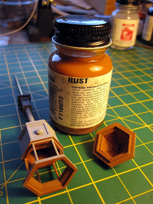
Floquil Rust is one of my favorites in that its a pretty good color for replicating a mahogany color. These towers were built during the age of when mahogany (or similar) was a common building material for streetcar interiors. So I'm willing to bet these towers had this type of interior.

Again, a day of drying.

 Masking off the cupola, the ironworks are painted Floquil Pullman Green.

To prevent the mask from adhering to the previous layer of paint, or chipping the new layer of paint,  I pull off the mask as soon the paint begins to set and is still somewhat flexible.

Another day, another dry.

The ironworks and interior are masked off for a nice coat of Floquil Depot Buff.

 Well hey there handsome! Oh wait! I forgot something...

 Some Floqul Brass for the gong. We can't forget the bling! No sir! Can't forget the bling!

Dandy


Monday, May 28, 2012

#426 Project ~ The Infamous Golden Yellow Paint Scheme

Painting a San Diego 400 Class 5 car in its as-delivered Mission Yellow and Mahogany Brown Paint Scheme. 
Now that this car has been properly prepared for painting, lets, oh I don't know, paint it?

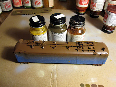
To make sure the delicate yellow paint shows up in its intended hue, the car is first painted with primer. I prefer good old fashioned Floquil paints applied with a good old fashioned Air Brush. These enamels require a day of drying between coats. So although the entire paint process is shown here all at once, at least a day elapsed between each color application.

Research I have done has shown that for cars built around the same time as these cars (1924), the favored interior color was a white of some sort. Most folks don't paint the interior of their models, but as time will tell, these cars will look so much better with a painted interior. Not to mention the protection the paint will provide against the deterioration of the brass. I chose Floquils Antique White as the interior color for #426.

After the interior paint has dried for a day, the windows, doors, bottom opening and any other orifice to the interior is masked off with ordinary masking tape.

Today's recipe for San Diego Electric Railway Mission Yellow is:
10 - 20 parts CNW Yellow
1 part Rock Island Maroon
It turns out that Floquil Rock Island Maroon is out of production of course. But another Tuscan Red color should work. I only chose Rock Island Maroon because its a gloss. The idea is this: CNW Yellow is the closest yellow available to the chrome yellow used on these cars. So by adding a Tuscan color, its reddish hue will push the yellow more towards orange without actually crossing the line into orangedom (These cars have been described as "Golden Yellow" but have never have been referred to as an orange of any sort). And its brownish qualities will "darken" the yellow a bit.

After the yellow has dried for at least a day, the entire body is masked off except for the doors. Today's recipe for Mahogany is:
1 part Roof Brown
1 part Tuscan Red
One thing I ended up regretting was not masking off the sliver of body showing between the doors and steps. This has proved troublesome to touch up afterwards. So next time!
Also, this color mix is a bit dark. Either it needs to have some white added, or the doors need to be lightened during the weathering process.

I have a theory about the roofs of these cars. I believe they were originally painted with a Tuscan Brown paint that oxidized over time. Later color photos reveal these cars roofs having achieved a rusty reddish brown. This reddish brown is the most common color used with modelers and restorers of San Diego cars. But I'm certain that when these cars were new, the roofs were more of a light chocolate brown. For this color I used:

1 part Roof Brown
1 part Southern Freight Car Brown
1 part CSX New Image Gold.


Details such as headlights, retrievers, trolley pole hold down hooks and towers, and bumper are brush painted Floquil Engine Black. The window frames are brush painted with the Mahogany mix. And there we have it! My latest, greatest shot at San Diego Electric Railways elusive Mission Yellow and Mahogany Brown paint scheme.

Next up is powering this model with Hollywood Foundry's new Diablo mechanism. Awesome stuffs so stay tuned! Yes sir! Awesome stuffs!

Dandy

Monday, January 09, 2012

Niles Project ~ Window Shades

Super Detailing Continued. Adding Window Shades to #107

 Styrene? Brass? Nah, just simple card stock. Index card in this case. The windows are in groups of twos and threes, so that's how I grouped the shades. Cut them size and painted them Floquil Freight Car Brown for its nice reddish brown color.

Glued 'em in place with good 'ol Micro Kristal Kleer and we got it made-in-the-shade. Yes sir! Made-in-the-shade!

Dandy

Monday, October 03, 2011

Niles Project ~ Gates

Passenger gates make for a nifty little detail to add to these models.

 These gates in the doorways are included on all the San Diego Niles cars, so my models shall be so equipped. And why not? They are easy enough to add because...

...Cal Scale offers "Tailgates" for passenger cars that should fit the bill here just fine. They are available in brass (left) of plastic (right). I bought both to see which I preferred but forgot to add the brass gates during the soldering of brass details stage of construction. Soldering after the fact will ruin the paint on the cars. So #105, #107, and #109 will get the plastic gates. #110 will get the brass gates since it hasn't been painted yet.


Even though the plastic gates are black, I painted them with Floquil Engine Black paint anyway. Black plastic always looks like black plastic. Floquil paints are dead flat and kill the shine beautifully. A little bit of weathering chalks will help bring out the detail again.


A tad bit over sized, the Cal Scale gates achieve the desired effect anyway. The gates are glued in with good 'ol Micro Kristal Kleer.
The Passengers have found there seats and Conductor Carl has closed the gates. Were ready to roll. Yes Sir! Were ready to roll!

Dandy

Monday, December 06, 2010

Niles Project ~ Applying Decals to #107

Now that the decals are made, I'm going to try a different technique of applying the decals so as to help them settle more easily into the wood slats.


Remember, decals have to be applied onto glossy surfaces. Since I painted #107 with Floquil paints, which dry dead flat, a coat of gloss has to be sprayed on to where the decals are going to go. AND the decals need to be sealed as well. So while I have the gloss in the airbrush, I'll coat the decals with it as well.


Okay, Floquil Hi Gloss has been applied to the decals and #107. While they dry let me recap the decaling of #105...

With #105 the decals didn't want to settle into the deep wood slats. Eventually, the parts of the decal with air under it will dry out and flake off. So I'll probably loose that part of the "5", and the 3D drop shadow of the "0", and the rose buds on the corner flourish of the pin stripping, etc.  So after discussing the matter with Don Ball, it was concluded that it was difficult for the air to escape from under the vast expanse of the decal paper. So he suggested cutting the decals closer to the printing:


With a new, sharp eXacto blade, I cut out the negative areas of the decals that didn't contain any printing. But while applying the decals, I had a horrible problems with the decals curling! I wasn't able to get any photos since I was frantically trying to get the decals to lay down flat and straight before they set. Some decals got so distorted that I had to scrape them off and print new ones. Now its quite possible that this happened because the decal paper I used is over a year old. Fresh paper might behave better, but I don't know for sure. But I'll be sure to start with fresh decal paper next time since decal paper doesn't cost and arm or a leg.


Decaled and sealed with Dull Cote. Over all it looks good! But under closer inspection, the pinstripes are a bit wiggly, air bubbles can be seen here and there, and the edges of the decals are visible. Hopefully, some of these imperfections will be hidden by a bit of weathering. But over all, its looking good. Yes sir! Looking good!

Dandy